Creative Standards
Creative Standards
Brand creative standards ensures our messaging and design visuals are consistent across all channels and platforms. These standards apply university-wide to all marketing and communication practices.

Editorial
We aim for authentic, compassionate stories that demonstrate Loyola’s positive impact in the world.

Photography
We connect viewers to Loyola through emotive, experiential imagery that highlights real Loyolans in everyday life.

Charts and Graphs
We use graphics to express simple trends and to compare data to each other or over time.

Maps
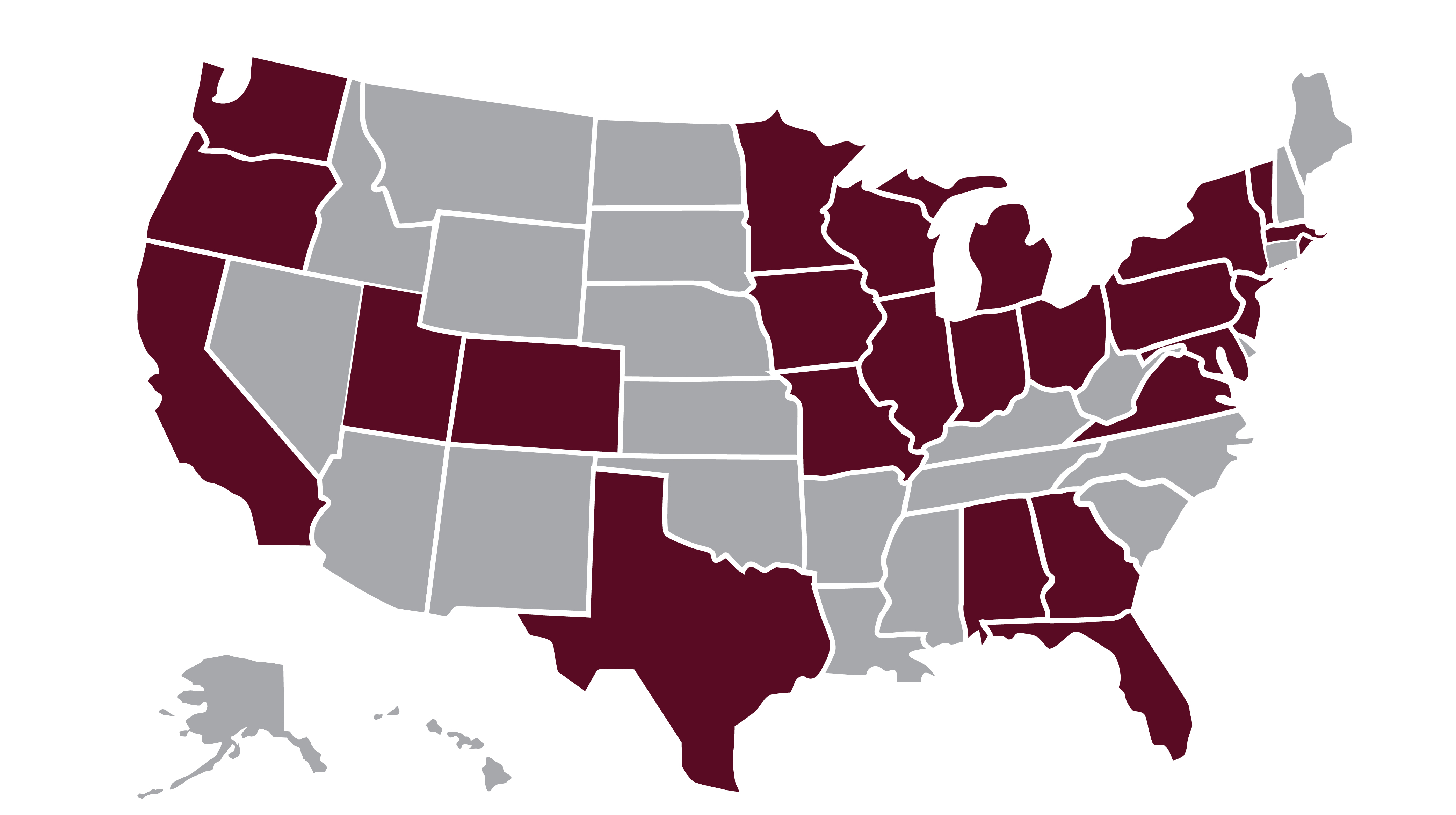
When locations are not widely known, use a map. It should be only as complicated as necessary.
